work-state: From Events to Intelligence — Building the Reporting Layer
April 30, 2026work-statekanbandashboardinventoryharvestersreportingbuilding-in-publicnext-jspersonal-intelligence
# work-state: From Events to Intelligence — Building the Reporting Layer
The harvesters ran. GitHub commits landed. Gmail sent events arrived. Slack messages normalized into the canonical envelope. After a few days of collection, `~/work-state/events/` held hundreds of atomic JSON files, one per surface event, each with a timestamp, a project attribution, a type, evidence, and metrics.
And then nothing. Because events in flat files are not intelligence. They are raw material. Reading the corpus meant grepping directories. Checking a project meant scanning `state.json`. Understanding what was happening across a portfolio meant doing arithmetic in your head.
The substrate does its job. The question becomes: what do you build on top of it?
## The question that drove each screen
David built three reporting surfaces, each driven by a different question the corpus could answer but couldn't surface on its own.
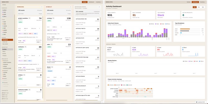
The **Dashboard** answers: *what is the macro shape of my work right now?* Volume over time, surface trends, project heatmap. The kind of question you ask at the start of the week or after a month of heads-down building, when you want to know what the pattern looks like from the outside.
The **Kanban** answers: *which projects are alive, which are dormant, and what's happening in each one right now?* Projects as cards, grouped by portfolio or status or activity temperature, with sparklines and surface breakdowns per card. The kind of view you check in the morning before deciding where to put the day.
The **Inventory** answers: *what do I have?* All projects, all repos, all attribution — in a single searchable, sortable, filterable ledger. The kind of question you only ask when the portfolio has grown beyond what fits in working memory, or when something is clearly active in the events but you can't figure out where it belongs.
Three screens. Three questions. Each one reads the same corpus through a different lens.
## Architecture: reading the corpus directly
The reporting layer is a Next.js application running locally on port 3333. It does not have its own database. It does not maintain separate state. It reads `~/work-state/` directly — `manifest.yaml`, `state.json`, and the `events/` directory — via server-side API routes.
```
work-state/kanban/
├── src/app/api/projects/route.ts ← walks events/, builds per-project stats
├── src/app/api/events/route.ts ← per-project event list for nib panel
├── src/app/api/timeline/route.ts ← daily/weekly aggregates for dashboard
├── src/app/page.tsx ← Kanban
├── src/app/dashboard/page.tsx ← Dashboard
└── src/app/inventory/page.tsx ← Inventory
```
The projects API route is the workhorse. On each request, it:
1. Loads `manifest.yaml` — the canonical list of projects, their portfolios, priorities, and statuses
2. Loads `state.json` — cumulative counters and last-harvest timestamps
3. Walks `events/YYYY-MM-DD/*.json` for the requested time window (7, 30, 90, or 365 days)
4. Builds per-project buckets: event counts by surface, by type, 14-day sparklines, repo attribution, themes
5. Identifies untracked repos — GitHub repos appearing in events that don't match any manifest project
6. Returns a single JSON payload the UI components read
Every page load is a fresh read. No caching, no stale state. The corpus is the source of truth.
## The Kanban
The kanban is the primary daily interface. Projects become cards. Cards live in columns. The grouping is switchable: portfolio, status, activity temperature (hot/warm/cool/silent), or timeline (today/yesterday/this week/earlier).
Each card is a compressed view of a project:
- Event count for the period, plus a 14-day sparkline
- Type breakdown: how many builds versus shares versus receives versus drafts
- Surface pills: which surfaces have events, with counts
- Repos: which GitHub repos have commits attributed to this project
- Themes: the top semantic tags on this project's events
- Last event: what happened, on which surface, how long ago
- A detail trigger — the "nib panel" — that slides in from the right and shows the raw event list
The column-level summary card sits at the top of each column and aggregates across all visible projects: total events, surface proportion bar, last active. The column disappears entirely if all its projects are hidden or filtered out. No empty columns.
Two controls that turned out to matter more than expected:
**The project toggle.** The left sidebar lists every project grouped by portfolio. Click any project name to hide it from the board — and if its column becomes empty, the column vanishes. This sounds like a cosmetic feature. In practice it is a focus tool. When the board has sixteen projects and you want to think about one portfolio, you collapse the rest in three clicks.
**The focus filter.** Three states: All, Code only, Has comms. This one came directly from data.
## The code-only problem
A few days into running the harvesters, something looked wrong. The `oaira` project was showing a large number of events — Slack messages, emails, a few Google Docs — and appearing active by most metrics. But the actual development work on oaira had been relentless: commits every day, repos moving fast.
The events told a different story because Slack and Gmail events are noisy. A single thread with multiple participants generates many receive events. A single email thread from an external correspondent generates more inbound events than a week of commits. The comms surfaces were drowning the build signal.
The fix was a flag: `is_code_only`. A project is code-only if it has GitHub build events in the period but zero events from Gmail, Slack, or GDocs. The projects API computes this per project. The kanban renders a small amber badge on the card. The focus filter lets you reduce the board to just those projects — the ones where all the evidence of work is in the code.
This matters because GitHub is often the most honest signal. A commit is an irreversible, timestamped, content-bearing act. It cannot be delegated, summarized, or misremembered into existence. When a project is code-only, it means someone is building something and the conversation about it hasn't started yet — or the conversation is happening in channels the harvesters don't cover.
## Untracked repos
The second discovery was subtler. While building the repos section per project card, the API started computing a separate bucket: GitHub repos appearing in events that don't match any project in `manifest.yaml`.
The mechanism is straightforward. Every GitHub commit event has an `evidence.repo` field — the full org/name string of the repository. The projects route tracks which repos appear under which project attributions. Any repo that shows up under `unsorted` or an unknown project ID lands in `untracked_repos`.
On a board with sixteen manifest projects and a GitHub account with twenty-something active repos, several repos had accumulated hundreds of commits with no attribution. Some were infrastructure. Some were experiments. Some were projects that existed in reality before they existed in the manifest.
The Untracked Repos column sits on the right edge of the kanban — dashed border, stone background, visually distinct. It shows every unattributed repo, commit count, and last commit time. It is a mirror that shows you what GitHub knows about your work that your project manifest doesn't.
Fixing untracked repos means updating `manifest.yaml` — adding projects, adding aliases so the attribution heuristic can match commit evidence to the right project. The column gradually empties as the manifest catches up to reality.
## The Dashboard
The dashboard is the macro view. It doesn't show projects; it shows time.
Four stat cards at the top: total events in period, daily average, top surface, active project count. Below that, five charts:
**Daily Event Volume** — a stacked SVG bar chart, one bar per day, coloured by surface. The shape of a week is immediately legible: whether GitHub or Slack leads, whether weekends go quiet, whether there are multi-day gaps that the calendar would have papered over.
**Type Breakdown** — horizontal bars by event type across the whole period. Share versus build versus receive versus draft. When share events lead, the output has been outbound. When receive events lead, the period was reactive. The ratio tells you something about where attention went that a simple event count obscures.
**Surface Trends** — one sparkline card per surface, showing that surface's daily volume. Slack trending up while GitHub trends down means the mode has shifted from building to coordinating. The cards make that visible without requiring the reader to form the comparison manually.
**Weekly Rhythm** — five weeks of stacked bars, Monday-aligned. The weekly shape of work.
**Project Activity Heatmap** — one row per project, one cell per day, colour intensity proportional to event count. Portfolio colour-coded: amber for Worksona, orange for Atomic47, rose for Nutabu, teal for Personal. This is the one view that answers the honest question: where has the time actually gone? Not where the plan said it would go. Not what the calendar shows. What the events record.
## The Inventory
The inventory is the ledger. Both tabs — Projects and Repos — support search, sort, filter, and a toggle between card grid and dense list view.
The Projects tab surfaces things the kanban doesn't: all projects regardless of grouping, sortable by priority or recent activity or all-time event count or portfolio. The list view compresses a project to one row: name, portfolio badge, status badge, priority, event counts, surface pills, top repo, top themes, last activity. Dense enough to scan sixteen projects in a glance.
The Repos tab merges attributed repos and untracked repos into a single list. Attributed repos show which project and portfolio they belong to. Untracked repos show a dashed "untracked" badge. Sort by commits or last commit date or name. Filter by portfolio — which immediately isolates whether the unattributed repos cluster around a particular area of the work.
This is the view you use when cleaning up the manifest, when onboarding a new project, or when trying to understand why a project's event count feels wrong. Not a daily view. A maintenance view. The kind of thing you open once a week and close in two minutes.
## Morning reports: the other output
The three UI screens are the interactive reporting layer. The other output is the digest — a morning report that arrives as a Claude conversation, triggered on schedule, summarizing the previous day's events against the project manifest.
The digest reads the same corpus the UI reads. It answers the same questions the kanban and dashboard answer, but in prose: what built, what was shared, what came in, which projects moved, which projects went quiet, what themes appeared. A two-minute read that replaces the mental reconstruction most people do imperfectly over coffee.
The digest and the UI are not redundant. The digest forces a narrative over the events. The UI lets you interrogate the events. Both are necessary. A narrative without interrogation becomes what the author remembers, not what the evidence says. Interrogation without narrative becomes endless browsing.
## Where the evidence leads
Three things the data revealed that were not visible before the reporting layer existed:
**The portfolio split.** Across a month of events, two portfolios absorbed more than eighty percent of the build events. The other two had activity — comms events, receives, some drafts — but very little building. The manifest had a clean four-way split. The evidence didn't.
**The mode drift.** The type breakdown chart showed share events leading for two of the four weeks in the sample period. The plan for those weeks was build-heavy. The evidence said coordination-heavy. Not wrong — there were real reasons — but the drift between plan and execution was invisible until it was charted.
**The attribution gap.** Seventeen repos in the GitHub events. Nine in the manifest. The eight untracked repos had a combined 251 commits in the 30-day window. That work was happening. The manifest didn't know about it. The corpus did.
## What this is and isn't
The reporting layer is a read-only view of a write-only corpus. It does not modify events. It does not edit the manifest. It does not create projects or close them. It reads, aggregates, and renders.
The intelligence — the insight — comes from the data, not from the UI. The kanban doesn't generate understanding. It makes understanding possible by making the patterns visible. The heatmap doesn't tell you the portfolio split is off. It shows you the cells, and your eye completes the inference.
That is the right division. The system captures evidence faithfully. The reporting layer surfaces that evidence without interpretation. The person reads it.
The corpus keeps growing. The harvesters keep running. The daily digest arrives in the morning. The three screens are there when you need to see the shape of the work. The untracked repos column keeps asking, quietly, whether the manifest reflects what the evidence already knows.
That is the reporting layer. Three screens, one question each, built on the same flat files the harvesters have been writing since the first day the pattern turned inward.